

Oracle Brewing Co. is a craft brewery founded in London, ON by two psychotherapists with a shared fascination for divination practices and their relationship to mental health.
Launched during the pandemic as a passion project, Oracle needed a brand identity as distinctive as its origin story, one that could stand out on a shelf and signal something genuinely unusual about the people behind it.
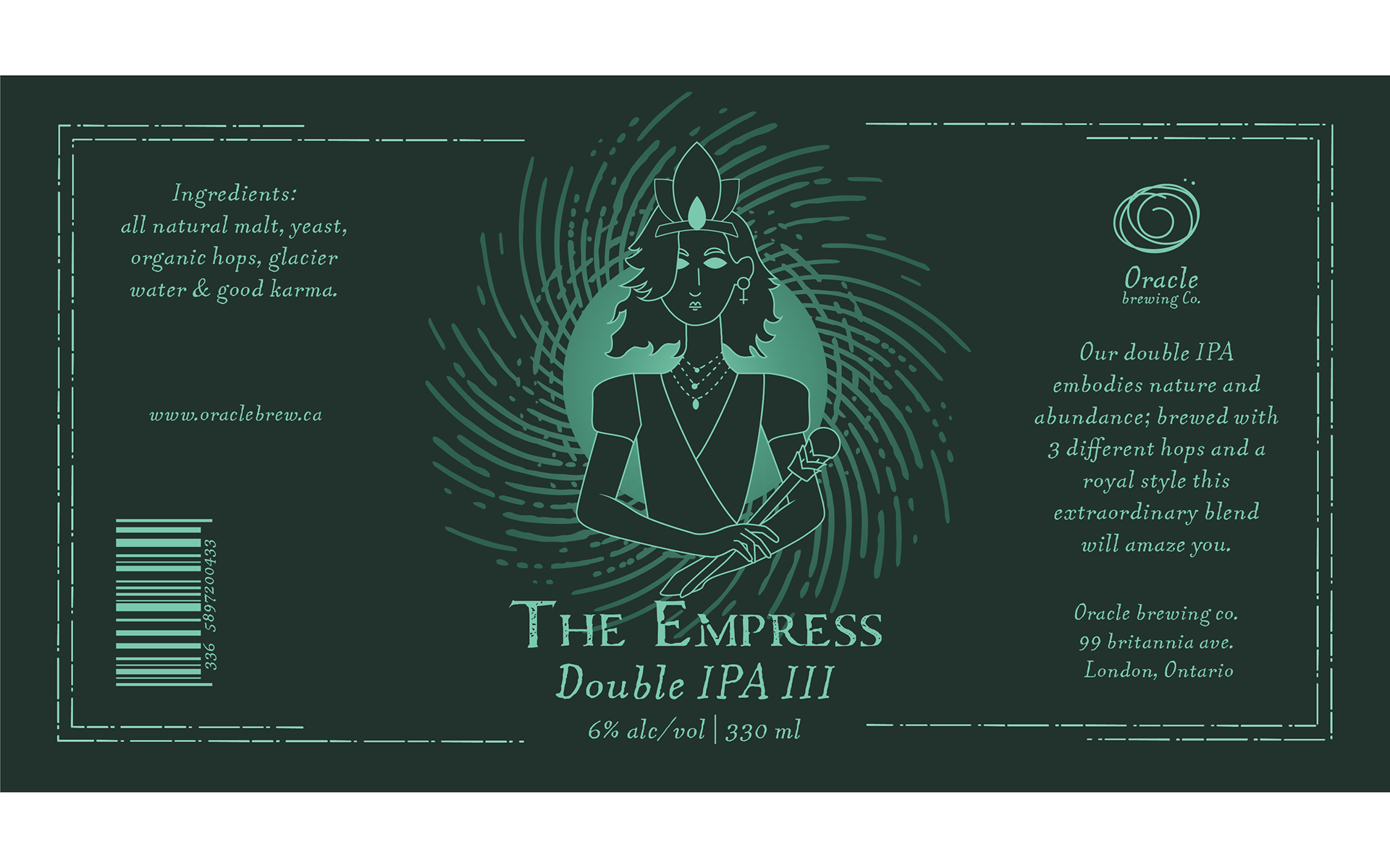
This is the label design for their first batch.
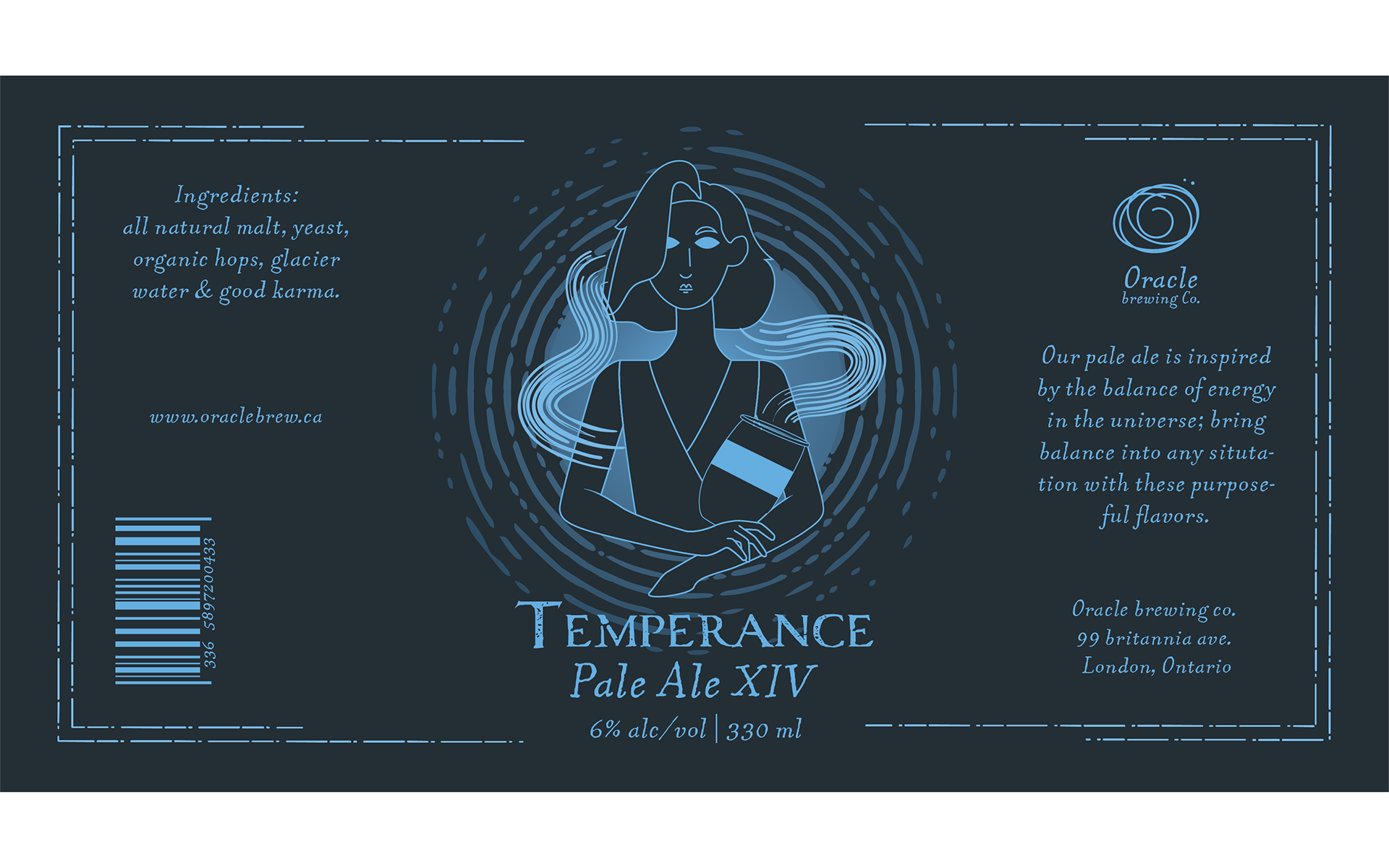
Each label is anchored by a major arcana tarot card selected by pairing the card's symbolic meaning with the character of each beer. The design extracts the essential iconographic elements of each card rather than reproducing the full image, creating a system that's consistent across the range but visually distinct per SKU.
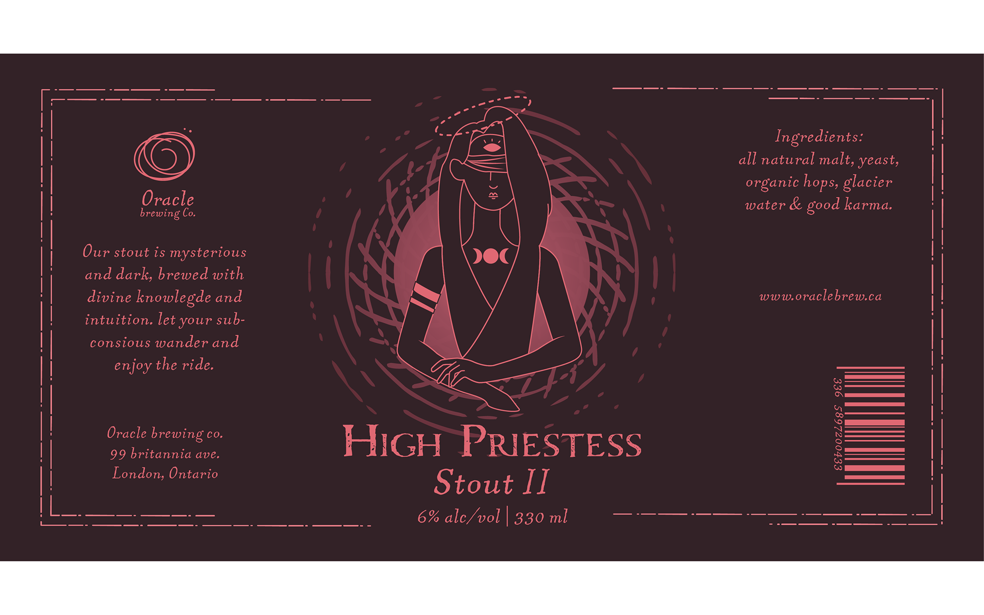
The monochromatic palette creates a simulated glow effect, maximizing contrast and shelf visibility while keeping the aesthetic cohesive across the range. At a distance, the label reads as a single bold shape. Up close, the illustration rewards attention.
Supporting print ads, extending the tarot aesthetic into a campaign format designed to drive trial for the launch batch.
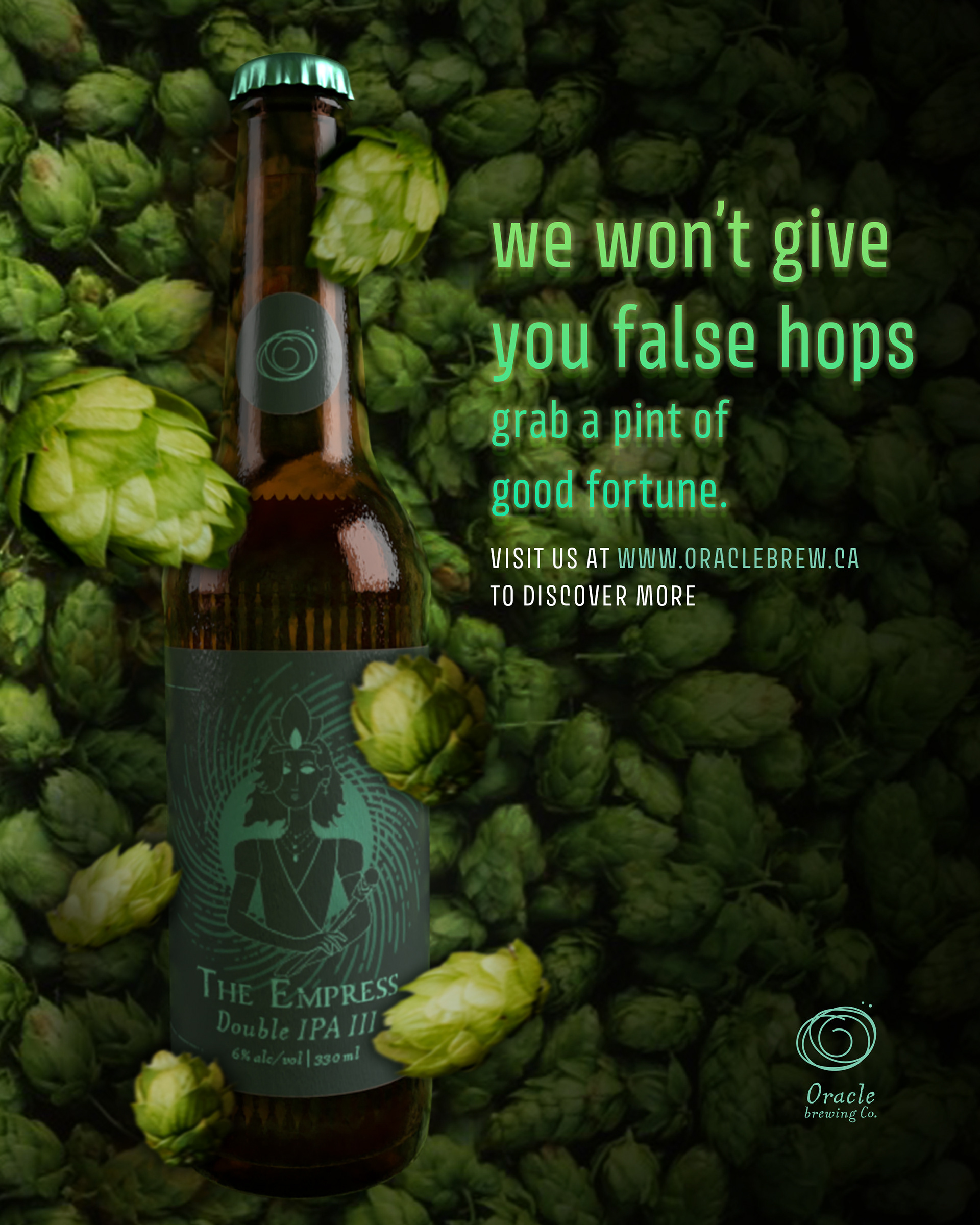
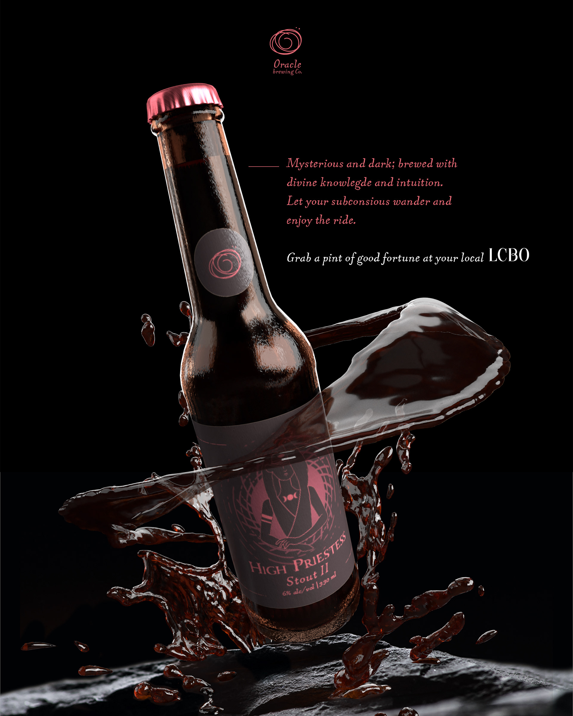
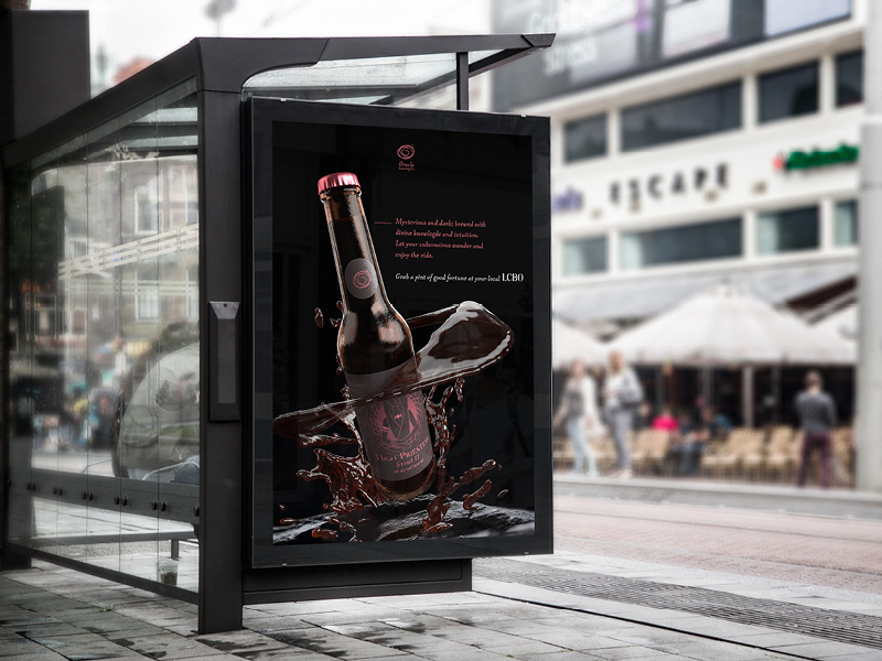
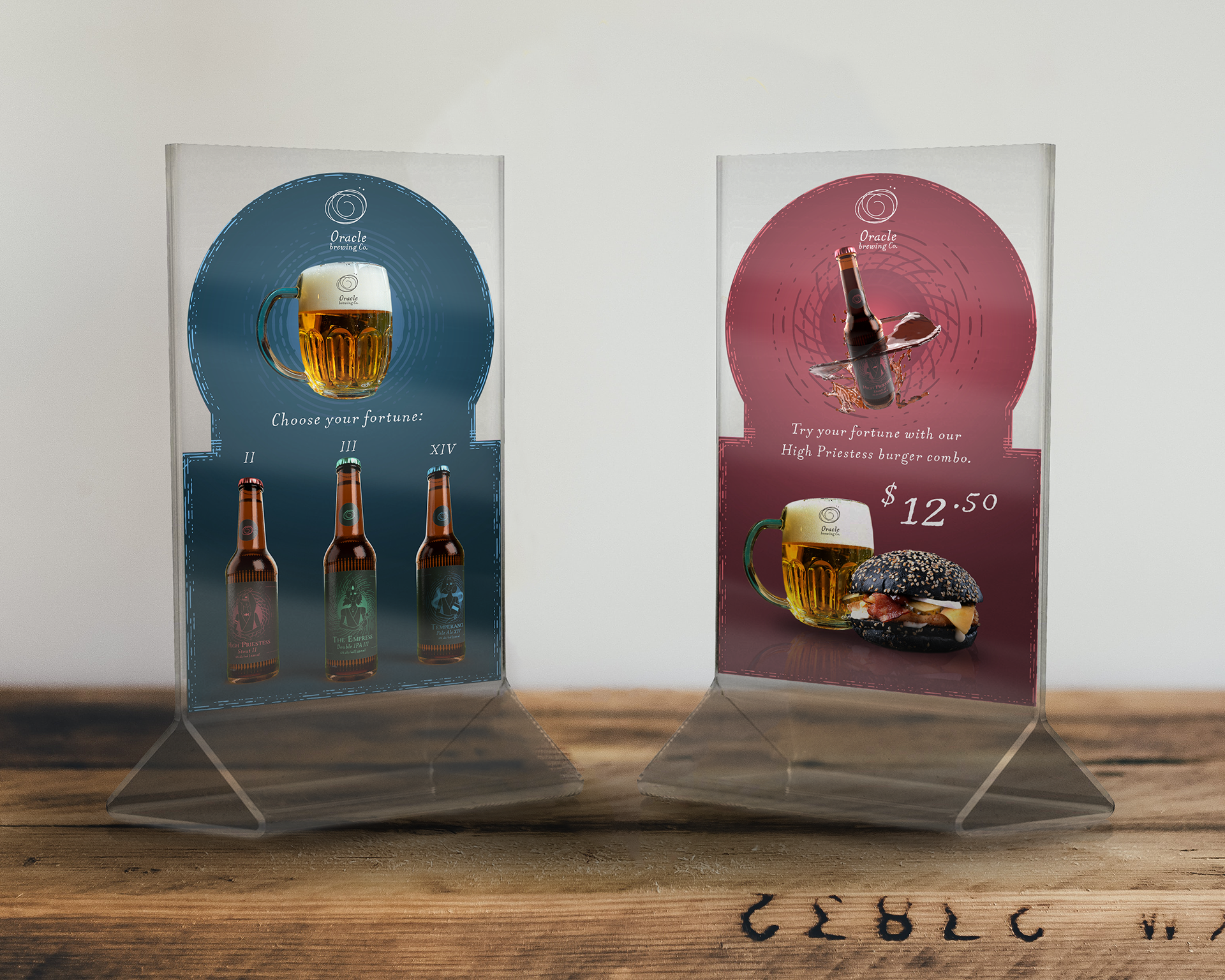
Table toppers for local restaurant placement, a point-of-sale touchpoint designed to prompt trial at the moment of ordering, using the same visual language as the label.