Under the Volcano was the first Mexican restaurant in London, ON. With new restaurants coming into town and a whole new generation in the spotlight, Under the Volcano wanted to update its branding into a more modern and competitive style, while reaffirming its roots and tradition.
The objective was to create a new branding for the restaurant, which would appeal to a younger generation and remain relevant in the city.
Inspiration


For the creation of this rebranding, I got inspiration from tradicional Mexican art.
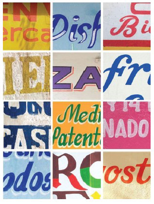
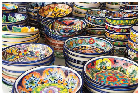
A limited color palette taken from the 80s movie posters, elements from a tradicional pottery art called Talavera, and a multitude of hand-painted street lettering were the base of my design.
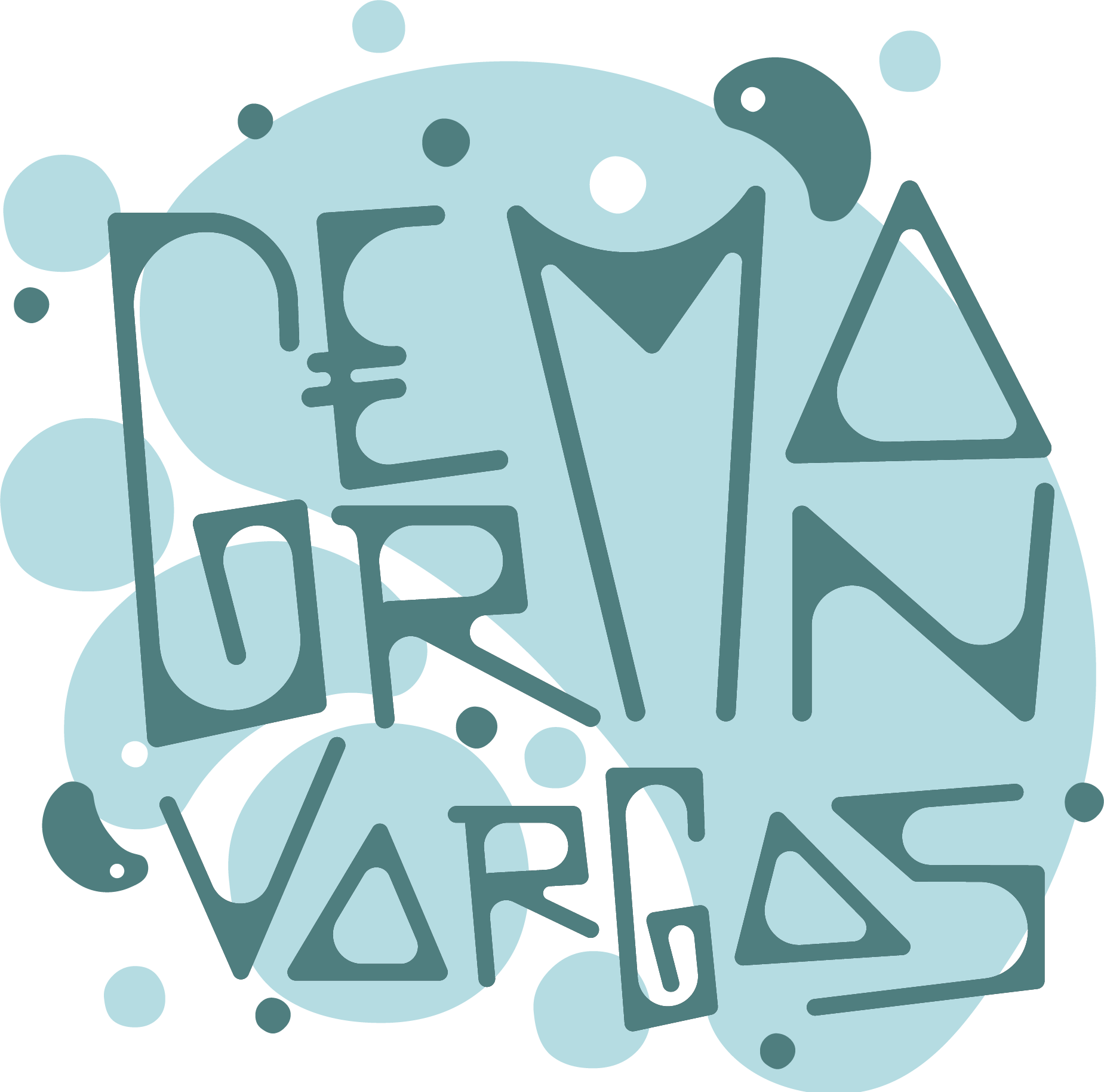
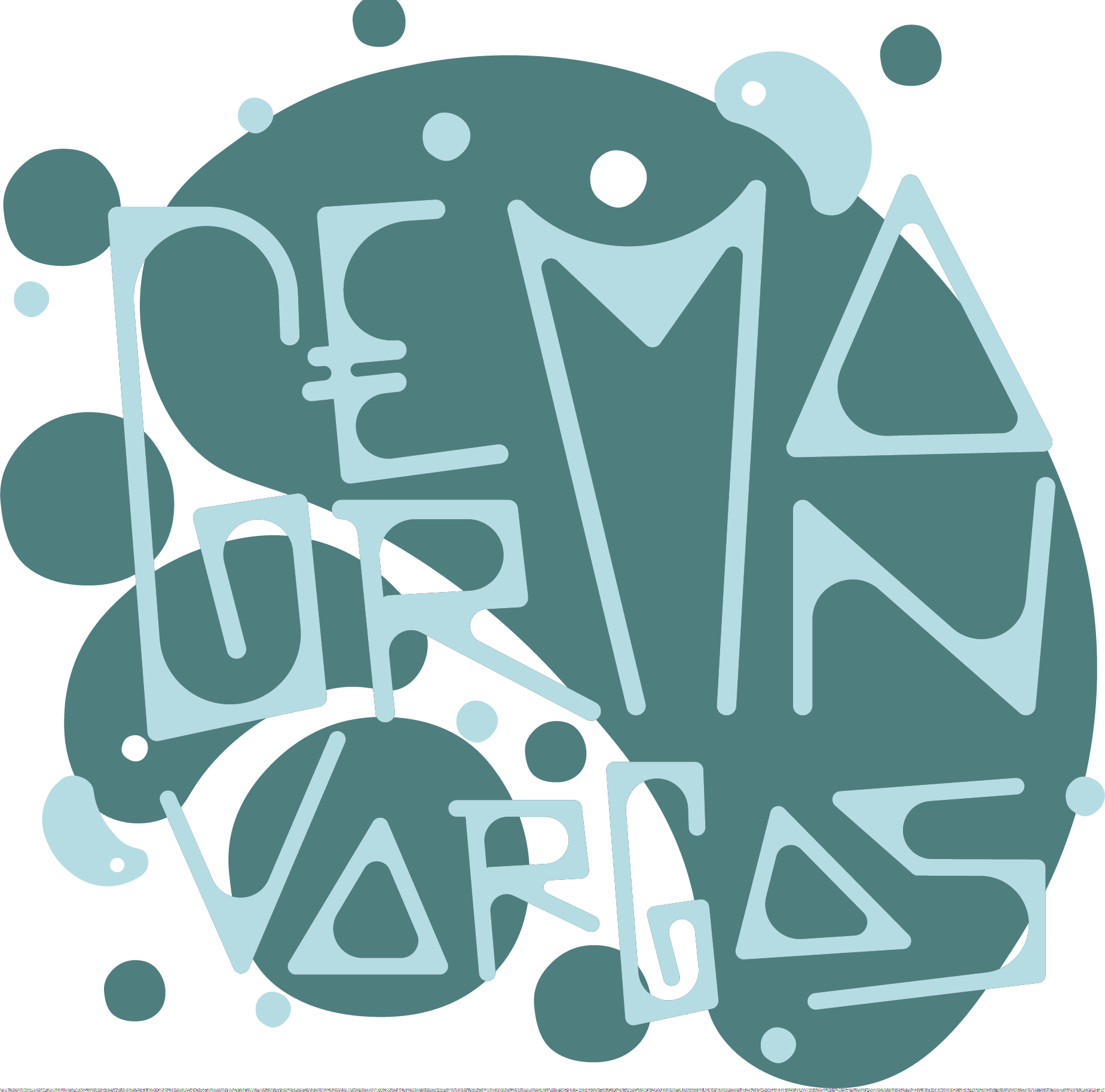
Since Under the Volcano was the first authentic Mexican restaurant in London, this logo represents the traditional sense of the brand by its minimal palette and stamp seal style. The logo implements symbols that represent Mexican cuisine and happy spirit.
It is a friendly logo that communicates a sense of warmth, flavor, and fun.
In order to participate in food festivals across the region and self-promote the brand, a food truck branding design and a simplified menu were created.

